Creative Lesson Planning
Image Posted on Updated on
One of the ways I see creativity being stifled is when well meaning teachers plan their lessons. Instead of planning for freedom of choice, they plan very controlled experiences. Instead of encouraging risk and exploration they limit the materials to keep outcomes high. Teachers develop ‘tricks’ of the trade: i.e. how to get good outcomes, instead of focussing on which method has the most learning value. Becoming experienced at teaching shouldn’t mean only making high quality art, but rather what learning is the most valuable to the pupil and that sometimes means making some horrid art!
Many teachers work long into the night (I’ve done it myself) planning and providing everything; stimuli, visual sources, artist references, they plan every stage of the making and carefully ensure that everyone’s ability range is catered for. All that remains is for the children to turn up, behave themselves and do the art they are instructed. But planning lessons should focus on creating rich, challenging, diverse and personal learning experiences, NOT how to get the best outcomes.
Let me show you what I mean, the following lesson is an Illuminated Lettering lesson I taught to year 5 many years ago. I was really proud of the standard of outcomes and everyone congratulated me. I thought it was a good lesson for many years until I learned what I was doing:

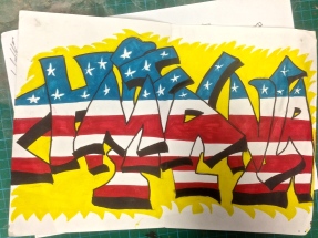
Illuminated lettering
- Pupils studied illuminated lettering making copies in their books. DESIGN INFLUENCES ARE LIMITED AND RESTRICTIVE
- They learned the history of why and how the letters were made. INTERESTING BUT IF THEY HAD CHOICE HERE IT WOULD EXPAND CREATIVE OUTCOMES
- They used a black fineliner to copy decorative patterns and details from the letters. GOOD BUT AGAIN LIMITED TO ONE METHOD
- They used plastic stencils to draw letters of the alphabet then coloured them using paint. INCREASES QUALITY BUT LIMITS LEARNING
- The teacher showed the group how to use the colour wheel for complimentary and harmonious colours and there was a strong emphasis on carefully controlling the brush and colour mixing. VERY GOOD SKILLS LEARNING (BUT THERE ARE BETTER WAYS TO TEACH SKILLS)
- They were given photocopies of illuminated lettering that they stuck to card. SO MUCH LEARNING HAS BEEN LOST HERE. RAISING THE STANDARD OF OUTCOMES IS KILLING CREATIVITY.
- They then glued small pieces of precut card onto their letter to create a 3D raised effect. SELF EXPLORATION OF 3D WOULD BE MUCH BETTER & ALLOW THEM TO EXPLORE & DISCOVER
- They then decorated them in an illuminated style using paint and coloured paper and added patterns with black pen when dry. THIS COULD BE MADE MORE CREATIVE BY EXTENDING THE RANGE OF LETTERING AND PATTERNS.
Whilst the outcomes of this project are of a high standard, my issue with this project is that so much creativity has been lost. What is required through the whole project is that the pupils mimic the teachers’ expectations. They all desperately want to do their work ‘right’ and be neat. In addition, they haven’t learned how to draw a letter on their own or how to adapt lettering to creative intentions. It surely is better for them to draw a letter poorly than to merely work over a template or photocopy? I would want pupils to learn how to draw letters independently, whatever the standard. I’d like them to get an understanding of different letter designs and how lettering can be used as a powerful way to illustrate mood. Why can’t they explore methods of making letters look 3D themselves? It’s better fun and they learn more. It’s still good to learn those colour relationships but maybe they could decorate them after looking at a range of patterns. Above all what I’d like to see is a range of outcomes in a variety of styles. I decided to rewrite the project to try to inject more creativity. This is what I came up with:

CREATIVE LETTER DESIGN
Activity 1: Let’s investigate lettering
Magazine sources, newspapers and computers.
Discussion: Why are there so many different styles of lettering?
Activity 1: COLLECTING INFORMATION TO INFORM CREATIVE THINKING
Using the sources provided, try to answer some or all of these questions: Are some styles of lettering more suitable for different kinds of text? What is it that makes letters look different? How many different styles of lettering can u see in the sources provided? Make a collage of your favourite lettering styles. Copy your favourites into your books and colour them in your favourite art materials. Working with a partner, compare two or more different letters. Now try to describe the differences between each.
Activity 2: DISCOVERING HOW LETTERING CAN HAVE CREATIVE MEANING
Can u show feeling and emotion with letters?
Dictionary: learn the word Font.
Type the word WORD three times into a computer programme. Using ONLY the font tool, try to make each word show these moods: Crazy, angry, clever. Next, can you create more emotions with fonts? How might you now draw the following words freehand without a computer? Shy, funny, silly, loud, happy, sad. Add colour and some detail if you can.
Plenary recap: Discuss: What have we learned about lettering?
Activity 3: DEVELOPING CREATIVITY BY DESIGNING OWN LETTERING
is it possible to design original fonts of our own?
Let’s see what you know already. How would you draw your name if you were asked to draw it using lettering?
Let’s look at your results as a group and talk about them.
(Teacher assessment of ability)
Activity whole class: use (5mm) squared paper to help you design a lettering style (a font) Is it possible to make round letters and corners on squared paper? Can you still draw diagonal lines for letters such as A or W?
Less able tracing easier single sans serif letters on a scale more suitable for accuracy ie A5, then shading or colouring. More able to design higher level outcomes eg with serifs, adapting and manipulating the grid or perhaps not even needing a grid. When u finish designing your font you can name it and start using it. Write some words by tracing or copying your font them colour them with felt pens.
Plenary evaluation if outcomes where pupils suggest ways to improve designs.
Activity 4: LEARNING FROM OTHERS’ CREATIVE OUTCOMES?
Let’s investigate how artists have used lettering to create art: discuss a range of lettering from illuminated lettering to contemporary in table groups to identify: What features stand out the most? Which do you think would be hardest to draw? How has lettering changed over time?
Activity: Record by sketches and/or notes anything in the study of the lettering that you find interesting and that you might use in your own design. Would you want to change anything about your own lettering design after you have seen the artists work? How might you decorate your lettering? Reconsider the design and/or practice writing it in freehand. (Notice I haven’t asked them to make copies of other lettering styles, write about them, write personal opinions of them or stick them in their books? Everything I’ve asked them to do is related to informing their own designs and nothing more!)
Activity 5: TACTILE CREATIVITY (the best way to teach boys anything!): making a 3D version of their letter
Quesion What is the difference between a 2D object and a 3D object? Which material is best for making a 3D model of your letter? Problem solving. Have ready an assortment of card, polystyrene printing tiles, plasticine or modelling clay etc make trial versions of letters and discuss results. Share success and knowledge learned amingst the group. What worked best and why?
Activity Making 5 part 2. Now draw a 2D letter that you have designed and glue it to a card background. (Teacher may need to dictate a size and demonstrate safe card cutting techniques.) Intervention to support less able by assisting with cutting for example may be needed. More able might make a sign for their bedroom or school for example. The letters should be A5 approx in size. The outcomes should vary enormously in quality but that’s ok. Tell them it might take several attempts to get right. Would simplifying the design help?
Activity 6: DECORATIVE & COLOUR CREATIVITY Painting the letter. Look at the colour wheel and identify three colours you might use. Two must be complimentary (opposite on the wheel) harmonious are three adjacent colours. Some investigation of patterns might be made. Techniques to paint using side or tip of brush should be shown. Decorate using your own preferred techniques learned from lettering study.
In this way I had a wide range of outcome and experiences. pupils had a lot of choice within the exercise and could adapt the outcomes at each stage to suit their own tastes and preferences. They learned from each other and collaborative experience was evident. Pupils took immense pride in what they had done, they brought additional materials in from home such as metallic spray paint and had a real sense of ownership. They couldn’t wait to take them home and I was unable to make a wall display because none were left! By contrast; back to my illuminated lettering display. I announced in assembly that I was taking the display down and pupils were free to come and collect them. Not one person did.

10/12/2014 at 10:38 pm
What if you start with a concept then to a message the students want to communicate, the apply this creative lettering exploration to presenting that message. For example, have a discussion about social issues at the school,brainstorming a class list. Have students individually select a social issue of interest, write and edit a very short message to address it 2-5 words), then explore how lettering communicates different ideas so they can layer that with the selected message. Just a thought that might get a purpose behind their exploration.